
linear-gradient() 函数用于创建一个线性渐变的 “图像”
语法:
background: linear-gradient(direction, color-stop1, color-stop2, ...);
direction:用角度值指定渐变的方向
方向值:常用的是to top,to bottom,to left,to right,to right top等等
角度值:常用的是0deg,90deg,180deg等等
color-stop1:
color:
使用关键字red、rgba,#ccc等颜色值(透明也可以设置)
stop:
是这个颜色块终止位置,换句话说就是这块颜色占的区域
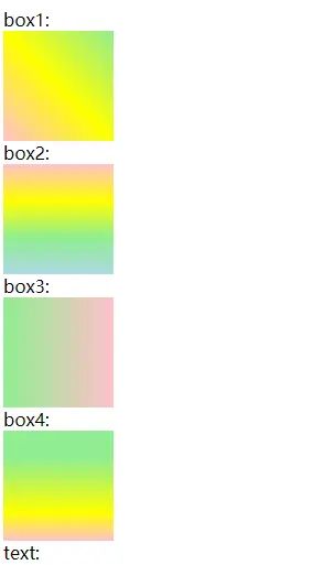
案列一:背景/文字
css:
<style>
    .box1 {
        width: 100px;
        height: 100px;
        background: linear-gradient(to right top,  pink,yellow,lightgreen
    );
    }

    .box2 {
        width: 100px;
        height: 100px;
        background: linear-gradient(to bottom, pink,yellow,lightgreen, lightblue
        );
    }
    .box3 {
        width: 100px;
        height: 100px;
        background: linear-gradient(90deg, lightgreen
    , pink);
    }

    .box4 {
        width: 100px;
        height: 100px;
        background: linear-gradient(180deg, lightgreen 25%, yellow 75%,pink 100%
        );
    }

    .text {
        background: linear-gradient(180deg, red , blue
        );
        -webkit-background-clip: text;
        color: transparent;

      /* background: background: linear-gradient(…) 为文本元素提供渐变背景。
         webkit-background-clip: text 用文本剪辑背景,用渐变背景作为颜色填充文本。
         color: transparent 使用透明颜色填充文本。*/
    }
</style>
html
<span>box1:</span>
    <div class="box1">
    </div>

    <span>box2:</span>
    <div class="box2">
    </div>

    <span>box3:</span>
    <div class="box3">
    </div>

    <span>box4:</span>
    <div class="box4">
    </div>

    <span>text:</span>
    <h1 class="text">
        我是渐变的文字啊
    </h1>
效果图:
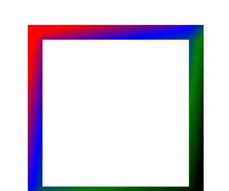
案列二:边框
css
.main {
        margin: 300px;
        width: 300px;
        height: 300px;
        border: 30px solid;
        border-image: -webkit-linear-gradient(top left,red 20%,blue 40%,green 60%,black 80%) 100 100 100 100;
    }
html:
<div class="main">
    </div>
效果图:
© 版权声明
文章版权归作者所有,未经允许请勿转载。如内容涉嫌侵权,请在本页底部进入<联系我们>进行举报投诉!
THE END


暂无评论内容