
介绍
使用 CSS 背景和边框来做一些,具有一些创造性的事情。渐变、背景图像和圆角,背景和边框的巧妙运用是 CSS 中许多样式问题的答案。
属性
背景 backgronud
用于一次性聚焦定义各种背景属性。
简写属性,包含如下:
background-clip、background-color、background-image、background-origin、background-position、background-repeat、background-size、 background-attachment
语法形式
background =
  [ <bg-layer># , ]? <final-bg-layer>

<bg-layer> =
  <bg-image>                      ||
  <bg-position> [ / <bg-size> ]?  ||
  <repeat-style>                  ||
  <attachment>                    ||
  <box>                           ||
  <box>

<final-bg-layer> =
  < background-color >            ||
  <bg-image>                      ||
  <bg-position> [ / <bg-size> ]?  ||
  <repeat-style>                  ||
  <attachment>                    ||
  <box>                           ||
  <box>

<bg-image> =
  <image>  |
  none

<bg-position> =
  [ left | center | right | top | bottom | <length-percentage> ]  |
  [ left | center | right | <length-percentage> ] [ top | center | bottom | <length-percentage> ]  |
  [ center | [ left | right ] <length-percentage>? ] && [ center | [ top | bottom ] <length-percentage>? ]

<bg-size> =
  [ <length-percentage [0,∞]> | auto ]{1,2}  |
  cover                                      |
  contain

<repeat-style> =
  repeat-x                                     |
  repeat-y                                     |
  [ repeat | space | round | no-repeat ]{1,2}

<attachment> =
  scroll  |
  fixed   |
  local

<box> =
  border-box   |
  padding-box  |
  content-box

<image> =
  <url>       |
  <gradient>

<length-percentage> =
  <length>      |
  <percentage>
语法示例:
使用 <background-color>
background: green;

使用 <bg-image> 和 <repeat-style>
background: url("test.jpg") repeat-y;

使用 <box> 和 <background-color>
background: border-box red;

将背景设为一张居中放大的图片
background: no-repeat center/80% url("../img/image.png");
background属性被指定 多个背景 层时,使用逗号分隔每个背景层。
每一层的语法如下:
在每一层中,下列的值可以出现 0 次或 1 次:
<attachment><bg-image><position><bg-size><repeat-style><bg-size>只能紧接着<position>出现,以”/”分割,如: “center/80%”.<box>可能出现 0 次、1 次或 2 次。如果出现 1 次,它同时设定background-origin和background-clip。如果出现 2 次,第一次的出现设置background-origin,第二次的出现设置background-clip。- `<background-color> 只能被包含在最后一层。
取值:
-
<attachment>:参见background-attachment -
<box>:参见background-clip和background-origin -
<background-color>:参见background-color -
<bg-image>:参见background-image -
<position>:参见background-position -
<repeat-style>:参见background-repeat -
<bg-size>:参见background-size
背景颜色 background-color
定义了 CSS 中任何元素的背景颜色。属性接受任何有效的<color>值。
背景色扩展到元素的内容和内边距的下面。
语法形式:
background-color =
  <color>
语法示例:
background-color: aqua;
background-color: #999999;
background-color: rgb(22, 33, 44);
background-color: rgba(22, 33, 44, 0.1);
背景图像 background-image
用于为一个元素设置一个或者多个背景图像。
语法形式:
background-image =
  <bg-image>#

<bg-image> =
  <image>  |
  none

<image> =
  <url>       |
  <gradient>
语法示例:
background-image:
  linear-gradient(to bottom,
  rgba(255,255,0,0.5),
  rgba(0,0,255,0.5)),
  url( https://mdn.mozillademos.org/files/7693/catfront.png );
取值:
-
none:是一个表明无背景图的关键字。 -
<image>: 用来标记将要显示的图片。支持多背景设置,背景之间以逗号隔开。
示例:
有两个方框——一个是比方框大的背景图像,另一个是星星的小图像。
.css
.a {
  background-image: url(balloons.jpg);
}
.b {
  background-image: url(star.png);
}

.html
<div class="wrapper">
  <div class="box a"></div>
  <div class="box b"></div>
</div>
效果:

- 默认情况下,大图不会缩小以适应方框,因此我们只能看到它的一个小角,
- 小图则是平铺以填充方框。
- 如果除了背景图像外,还指定了背景颜色,则图像将显示在颜色的顶部。
渐变背景
详情去看 CSS 数据类型 - <gradient>篇,此处不做过多赘述。
多背景图像
有兴趣的小伙子自己试试,下面介绍的属性也可以一起使用起来。
背景平铺 background-repeat
定义背景图像的重复方式。背景图像可以沿着水平轴,垂直轴,两个轴重复,或者根本不重复。
语法形式:
background-repeat =
  <repeat-style>#

<repeat-style> =
  repeat-x                                     |
  repeat-y                                     |
  [ repeat | space | round | no-repeat ]{1,2}
语法示例:
/* 单值语法 */
background-repeat: repeat-x;
background-repeat: repeat-y;
background-repeat: repeat;
background-repeat: space;
background-repeat: round;
background-repeat: no-repeat;

/* 双值语法:水平 horizontal | 垂直 vertical */
background-repeat: repeat space;
background-repeat: repeat repeat;
background-repeat: round space;
background-repeat: no-repeat round;

background-repeat: inherit;
取值:
-
<repeat-style>:单值语法是完整的双值语法的简写。
单值 等价于 双值
repeat-x == repeat no-repeat
repeat-y == no-repeat repeat
repeat == repeat repeat
space == space space
round == round round
no-repeat == no-repeat no-repeat
在双值语法中,第一个值表明水平重复行为,第二个值表明垂直重复行为。
-
repeat: 图像会按需重复来覆盖整个背景图片所在的区域。
最后一个图像会被裁剪,如果它的大小不合适的话。 -
space:图像会尽可能得重复,但是不会裁剪。
第一个和最后一个图像会被固定在元素的相应的边上,同时空白会均匀地分布在图像之间。background-position属性会被忽视,除非只有一个图像能被无裁剪地显示。只在一种情况下裁剪会发生,那就是图像太大了以至于没有足够的空间来完整显示一个图像。 -
round:随着允许的空间在尺寸上的增长,被重复的图像将会伸展 (没有空隙), 直到有足够的空间来添加一个图像。
当下一个图像被添加后,所有的当前的图像会被压缩来腾出空间。例如,一个图像原始大小是 260px, 重复三次之后,可能会被伸展到 300px, 直到另一个图像被加进来。这样他们就可能被压缩到 225px。 -
no-repeat:图像不会被重复。
那个没有被重复的背景图像的位置是由background-position属性来决定。
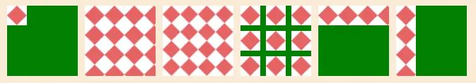
示例:
div{
    float: left;
    margin-left: 10px;
    background-color: green;
    width: 100px;
    height: 100px;
    background-image: url(./5.png);
}
#d1{ background-repeat: no-repeat; }
#d2{ background-repeat: repeat; }
#d3{ background-repeat: round; }
#d4{ background-repeat: space; }
#d5{ background-repeat: repeat-x; }
#d6{ background-repeat: repeat-y; }
效果:
背景大小 background-size
设置背景图片大小。图片可以保有其原有的尺寸,或者拉伸到新的尺寸,或者在保持其原有比例的同时缩放到元素的可用空间的尺寸。
语法形式:
background-size =
  <bg-size>#

<bg-size> =
  [ <length-percentage [0,∞]> | auto ]{1,2}  |
  cover                                      |
  contain

<length-percentage> =
  <length>      |
  <percentage>
语法示例:
background-size: contain;
background-size: cover;
background-size: 50%;
background-size: 3em;
background-size: auto 1em;
background-size: 50% 25%;
取值:
-
<length>:指定背景图片大小,不能为负值。 -
<percentage>:指定背景图片相对背景区的百分比,不能为负值。
背景区由background-origin设置,默认为盒模型的内容区与内边距,也可设置为只有内容区,或者还包括边框。如果attachment为fixed,背景区为浏览器可视区(即视口),不包括滚动条。 -
auto:以背景图片的比例缩放背景图片。 -
cover:缩放背景图片以完全 覆盖 背景区,可能背景图片部分看不见。
该背景图以它的全部宽或者高覆盖所在容器。当容器和背景图大小不同时,背景图的 左/右 或者 上/下 部分会被裁剪。 -
contain:缩放背景图片以完全 装入 背景区,可能背景区部分空白。
尽可能的缩放背景并保持图像的宽高比例(图像不会被压缩)。该背景图会填充所在的容器。当背景图和容器的大小的不同时,容器的空白区域(上/下或者左/右)会显示由background-color设置的背景颜色。
注意:位图必定有固有尺寸与固有比例,矢量图可能两者都有,也可能只有一个。渐变视为只有固有尺寸或者只有固有比例的图片。
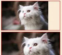
示例:
background-image: url(dw.png);
background-size: contain; // 上
background-size: cover; // 下
效果:
背景图像定位 background-position
为每一个背景图片设置初始位置。这个位置是相对于由 background-origin 定义的位置图层的。
简写属性,包含:
background-position-x 、background-position-y
语法形式
background-position =
  <bg-position>#

<bg-position> =
  [ left | center | right | top | bottom | <length-percentage> ]  |
  [ left | center | right | <length-percentage> ] [ top | center | bottom | <length-percentage> ]  |
  [ center | [ left | right ] <length-percentage>? ] && [ center | [ top | bottom ] <length-percentage>? ]

<length-percentage> =
  <length>      |
  <percentage>
语法示例
关键字值
background-position: top;
background-position: bottom;
background-position: left;
background-position: right;
background-position: center;

百分比
background-position: 25% 75%;

/* <length> values */
background-position: 0 0;
background-position: 1cm 2cm;
background-position: 10ch 8em;

多图像
background-position: 0 0, center;

边缘偏移值
background-position: bottom 10px right 20px;
background-position: right 3em bottom 10px;
background-position: bottom 10px right;
background-position: top right 10px;

/* Global values */
background-position: inherit;
background-position: initial;
background-position: revert;
background-position: unset;
取值:
-
<position>:定义一组x / y坐标(相对于一个元素盒子模型的边界),来放置。
可以使用一到四个值进行定义。用法参考:<position>的用法
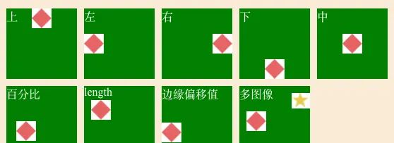
示例:
#d1{ background-position: top; }
#d2{ background-position: left; }
#d3{ background-position: right; }
#d4{ background-position: bottom; }
#d5{ background-position: center; }
#d6{ background-position: 20% 70%; }
#d7{ background-position: 10px 20px; }
#d8{ background-position: left bottom 20px; }
#d9{
    background-image: url(./5.png) , url(./6.png);
    background-position: 10px , right 10px;
}
效果:
背景附加 background-attachment
决定背景图像的位置是在 视口 内固定,或者随着包含它的区块滚动。
语法形式
background-attachment =
  <attachment>#

<attachment> =
  scroll  |
  fixed   |
  local
语法示例:
/* 关键 属性值 */
background-attachment: scroll;
background-attachment: fixed;
background-attachment: local;

/* 全局 属性值 */
background-attachment: inherit;
background-attachment: initial;
background-attachment: unset;
取值
-
scroll:使元素的背景 在html页面 滚动时滚动。
如果滚动了元素内容,则背景不会移动。实际上,背景被固定在页面的一样位置,所以它会随着html页面的滚动而滚动。 -
fixed:使元素的背景固定在 视图端口 上。
这样当页面或元素内容滚动时,它就不会滚动。它将始终保持在屏幕上一样的位置。 -
local:这个值是后来添加的 (它只在 Internet Explorer 9+中受支持,而其他的在 IE4+中受支持),由于滚动值相当混乱,在许多情况下并不能真正实现您想要的功能。局部值 将背景固定在设置的元素上 ,因此当您滚动元素时,背景也随之滚动。
background-attachment: fixed;   不跟随页面滑动 - 类似悬停 ;
background-attachment: scroll;  默认跟随页面滑动
背景图像的相对区域 background-origin
指定背景图片background-image 属性的原点位置的背景相对区域。
注意:当使用
background-attachment为fixed时,该属性将被忽略不起作用。
语法形式:
background-origin =
  <box>#

<box> =
  border-box   |
  padding-box  |
  content-box
语法示例:
background-origin: border-box
background-origin: padding-box
background-origin: content-box

background-origin: inherit
取值:
-
border-box:背景图片的摆放以 border 区域为参考 -
padding-box:背景图片的摆放以 padding 区域为参考 -
content-box:背景图片的摆放以 content 区域为参考
背景延伸 background-clip
设置元素的背景(背景图片或颜色)是否延伸到边框、内边距盒子、内容盒子下面。
语法形式:
background-clip =
<box>#

<box> =
border-box   |
padding-box  |
content-box
语法示例:
/* Keyword values */
background-clip: border-box;
background-clip: padding-box;
background-clip: content-box;
background-clip: text;

/* Global values */
background-clip: inherit;
background-clip: initial;
background-clip: unset;
取值:
-
border-box:背景延伸至边框外沿(但是在边框下层)。 -
padding-box:背景延伸至内边距(padding)外沿。不会绘制到边框处。 -
content-box:背景被裁剪至内容区(content box)外沿。 -
text:实验性 ,背景被裁剪成文字的前景色。
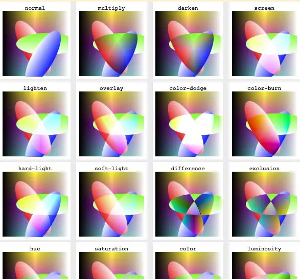
背景混合 background-blend-mode
定义该元素的背景图片,以及背景色如何混合。
混合模式应该按background-image 属性同样的顺序定义。
如果混合模式数量与背景图像的数量不相等,它会被截取至相等的数量。
语法形式:
background-blend-mode =
  <mix-blend-mode>#

<mix-blend-mode> =
  <blend-mode>  |
  plus-darker   |
  plus-lighter

<blend-mode> =
  normal       |
  multiply     |
  screen       |
  overlay      |
  darken       |
  lighten      |
  color-dodge  |
  color-burn   |
  hard-light   |
  soft-light   |
  difference   |
  exclusion    |
  hue          |
  saturation   |
  color        |
  luminosity
语法示例:
/* 单值 */
background-blend-mode: normal;

/* 双值,每个背景一个值 */
background-blend-mode: darken, luminosity;

background-blend-mode: initial;
background-blend-mode: inherit;
background-blend-mode: unset;
取值:
戳这里 CSS 数据类型 – <blend-mode>篇,也可以看看下面的属性做参看。
内容混合 min-blend-mode
元素的内容应该与元素的直系父元素的内容和元素的背景如何混合。
语法形式:
mix-blend-mode =
  <blend-mode>  |
  plus-darker   |
  plus-lighter

<blend-mode> =
  normal       |
  multiply     |
  screen       |
  overlay      |
  darken       |
  lighten      |
  color-dodge  |
  color-burn   |
  hard-light   |
  soft-light   |
  difference   |
  exclusion    |
  hue          |
  saturation   |
  color        |
  luminosity
语法示例:
mix-blend-mode: normal;
mix-blend-mode: multiply;
mix-blend-mode: screen;
mix-blend-mode: overlay;
mix-blend-mode: darken;
mix-blend-mode: lighten;
mix-blend-mode: color-dodge
mix-blend-mode: color-burn;
mix-blend-mode: hard-light;
mix-blend-mode: soft-light;
mix-blend-mode: difference;
mix-blend-mode: exclusion;
mix-blend-mode: hue;
mix-blend-mode: saturation;
mix-blend-mode: color;
mix-blend-mode: luminosity;

mix-blend-mode: initial;
mix-blend-mode: inherit;
mix-blend-mode: unset;
取值:
戳这里 CSS 数据类型 – <blend-mode>篇,看下面的示例。
示例:
-
单独混合(不与背景混合),效果:
-
全局混合(与背景混合),效果:
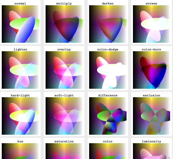
- ,效果:


暂无评论内容