
Flutter输入文本控件小结
TextField
属性解析
示例
TextFormField
属性解释
示例
CupertinoTextField
属性解析
示例
AutofillGroup
属性解析
示例
解释
扩展阅读
使用场景
EditableText
属性解析
示例
TextField和TextFormField区别
TextField
主要特点
TextFormField
主要特点
总结
备注:
1、flutter_quill(第三方库)
2、html_editor_enhanced(第三方库)
在 Flutter 中,除了用于显示文本的控件外,还有一系列用于用户输入文本的控件。这些输入文本控件主要包括 TextField 和 TextFormField 及其相关的一些配置和增强选项。以下是详细介绍:
TextField
TextField 是最基础的用户输入文本控件,用于单行或多行文本输入。
属性解析
const TextField({
    super.key,
    this.controller,
    this.focusNode,
    this.undoController,
    this.decoration = const InputDecoration(),
    TextInputType? keyboardType,
    this.textInputAction,
    this.textCapitalization = TextCapitalization.none,
    this.style,
    this.strutStyle,
    this.textAlign = TextAlign.start,
    this.textAlignVertical,
    this.textDirection,
    this.readOnly = false,
    @Deprecated(
      'Use `contextMenuBuilder` instead. '
      'This feature was deprecated after v3.3.0-0.5.pre.',
    )
    this.toolbarOptions,
    this.showCursor,
    this.autofocus = false,
    this.statesController,
    this.obscuringCharacter = '•',
    this.obscureText = false,
    this.autocorrect = true,
    SmartDashesType? smartDashesType,
    SmartQuotesType? smartQuotesType,
    this.enableSuggestions = true,
    this.maxLines = 1,
    this.minLines,
    this.expands = false,
    this.maxLength,
    this.maxLengthEnforcement,
    this.onChanged,
    this.onEditingComplete,
    this.onSubmitted,
    this.onAppPrivateCommand,
    this.inputFormatters,
    this.enabled,
    this.cursorWidth = 2.0,
    this.cursorHeight,
    this.cursorRadius,
    this.cursorOpacityAnimates,
    this.cursorColor,
    this.cursorErrorColor,
    this.selectionHeightStyle = ui.BoxHeightStyle.tight,
    this.selectionWidthStyle = ui.BoxWidthStyle.tight,
    this.keyboardAppearance,
    this.scrollPadding = const EdgeInsets.all(20.0),
    this.dragStartBehavior = DragStartBehavior.start,
    bool? enableInteractiveSelection,
    this.selectionControls,
    this.onTap,
    this.onTapAlwaysCalled = false,
    this.onTapOutside,
    this.mouseCursor,
    this.buildCounter,
    this.scrollController,
    this.scrollPhysics,
    this.autofillHints = const <String>[],
    this.contentInsertionConfiguration,
    this.clipBehavior = Clip.hardEdge,
    this.restorationId,
    this.scribbleEnabled = true,
    this.enableIMEPersonalizedLearning = true,
    this.contextMenuBuilder = _defaultContextMenuBuilder,
    this.canRequestFocus = true,
    this.spellCheckConfiguration,
    this.magnifierConfiguration,
  })
key: 控件的唯一标识符,用于树节点管理。
controller: 一个 TextEditingController 实例,用于控制文本内容和监听文字变化。
focusNode: 一个 FocusNode 实例,用于控制焦点状态。
undoController: 管理撤销操作的 UndoHistoryController 实例。
decoration: InputDecoration 对象,定义输入框的装饰外观,如标签、提示文本、边框等。
keyboardType: TextInputType 枚举,指定软键盘的类型,如 TextInputType.text, TextInputType.number 等。
textInputAction: TextInputAction 枚举,定义软键盘上的动作按钮类型,如完成、下一步等。
textCapitalization: TextCapitalization 枚举,设置文本自动大写模式。
style: TextStyle 对象,定义输入文本的样式,如颜色、字体大小等。
strutStyle: StrutStyle 对象,定义文本的排版样式。
textAlign: TextAlign 枚举,定义文本水平对齐方式。
textAlignVertical: TextAlignVertical 枚举,定义文本垂直对齐方式。
textDirection: TextDirection 枚举,定义文本方向。
readOnly: 布尔值,定义输入框是否为只读模式。
toolbarOptions: ToolbarOptions 对象,定义工具栏选项(已弃用)。
showCursor: 布尔值,定义是否显示光标。
autofocus: 布尔值,定义输入框是否自动获取焦点,默认为 false。
statesController: TextFieldStatesController 对象,控制文本状态。
obscuringCharacter: 字符串,定义隐藏文本时使用的字符,通常用于密码输入。
obscureText: 布尔值,定义是否隐藏文本,多用于密码输入。
autocorrect: 布尔值,定义是否启用自动拼写检查和纠正。
smartDashesType: SmartDashesType 枚举,定义智能破折号类型。
smartQuotesType: SmartQuotesType 枚举,定义智能引号类型。
enableSuggestions: 布尔值,定义是否启用输入建议。
maxLines: 整数,定义输入框的最大行数。
minLines: 整数,定义输入框的最小行数。
expands: 布尔值,定义输入框是否扩展以占用所有可用空间。
maxLength: 整数,定义文本的最大长度。
maxLengthEnforcement: MaxLengthEnforcement 枚举,定义最大长度的执行策略。
onChanged: 回调函数,当文本变化时触发。
onEditingComplete: 回调函数,当编辑完成时触发。
onSubmitted: 回调函数,当提交时触发。
onAppPrivateCommand: 回调函数,处理私有命令。
inputFormatters: 输入格式化程序列表,可用于限制输入类型或模式。
enabled: 布尔值,定义控件是否启用。
cursorWidth: 双精度浮点数,定义光标宽度。
cursorHeight: 双精度浮点数,定义光标高度。
cursorRadius: Radius 对象,定义光标的圆角半径。
cursorOpacityAnimates: 布尔值,定义光标透明度是否动画化。
cursorColor: 颜色对象,定义光标颜色。
cursorErrorColor: 颜色对象,定义光标错误状态下
selectionHeightStyle: 选择文本区的高度样式
selectionWidthStyle: 选择文本区的宽度样式
keyboardAppearance: 键盘外观
scrollPadding: 滚动填充,默认 20.0
dragStartBehavior: 拖动起始行为
enableInteractiveSelection: 是否启用交互选择
selectionControls: 自定义选择控件
onTap: 点击时的回调函数
onTapAlwaysCalled: 点击后是否总是调用 onTap
onTapOutside: 点击控件外部时的回调函数
mouseCursor: 鼠标光标
buildCounter: 构建计数器的方法
scrollController: 滚动控制器
scrollPhysics: 滚动物理特性
autofillHints: 自动填充提示
contentInsertionConfiguration: 内容插入配置
clipBehavior: 剪辑行为,默认硬剪辑
restorationId: 恢复 ID
scribbleEnabled: 是否启用 Apple Pencil scribble 支持,默认为 true
enableIMEPersonalizedLearning: 是否启用个性化学习,默认为 true
contextMenuBuilder: 上下文菜单构建器
canRequestFocus: 是否可以请求焦点,默认为 true
spellCheckConfiguration: 拼写检查配置
magnifierConfiguration: 放大镜配置
示例
class TextFieldDemo extends StatefulWidget {
  @override
  _TextFieldDemoState createState() => _TextFieldDemoState();
}

class _TextFieldDemoState extends State<TextFieldDemo> {
  final TextEditingController _controller = TextEditingController();
  final FocusNode _focusNode = FocusNode();

  @override
  void dispose() {
    _controller.dispose();
    _focusNode.dispose();
    super.dispose();
  }

  @override
  Widget build(BuildContext context) {
    return Scaffold(
      appBar: AppBar(title: Text('TextField Example')),
      body: SingleChildScrollView(
        child: TextField(
          key: UniqueKey(),
          controller: _controller,
          focusNode: _focusNode,
          decoration: InputDecoration(
            labelText: 'Enter text',
            border: OutlineInputBorder(),
            hintText: 'Hint text',
            helperText: 'Helper text',
            prefixIcon: Icon(Icons.text_fields),
            suffixIcon: Icon(Icons.check),
          ),
          keyboardType: TextInputType.text,
          textInputAction: TextInputAction.done,
          textCapitalization: TextCapitalization.sentences,
          style: TextStyle(color: Colors.blue, fontSize: 18.0),
          strutStyle: StrutStyle(fontSize: 18.0),
          textAlign: TextAlign.left,
          textAlignVertical: TextAlignVertical.top,
          textDirection: TextDirection.ltr,
          readOnly: false,
          showCursor: true,
          autofocus: true,
          obscuringCharacter: '*',
          obscureText: false,
          autocorrect: true,
          smartDashesType: SmartDashesType.enabled,
          smartQuotesType: SmartQuotesType.enabled,
          enableSuggestions: true,
          maxLines: 1,
          minLines: 1,
          expands: false,
          maxLength: 30,
          maxLengthEnforcement: MaxLengthEnforcement.enforced,
          onChanged: (text) {
            print('Text changed to: $text');
          },
          onEditingComplete: () {
            print('Editing complete');
          },
          onSubmitted: (text) {
            print('Text submitted: $text');
          },
          inputFormatters: [
            FilteringTextInputFormatter.allow(RegExp(r'[a-zA-Z]'))
          ],
          enabled: true,
          cursorWidth: 2.0,
          cursorHeight: 24.0,
          cursorRadius: Radius.circular(2.0),
          cursorColor: Colors.red,
          selectionHeightStyle: BoxHeightStyle.tight,
          selectionWidthStyle: BoxWidthStyle.tight,
          keyboardAppearance: Brightness.light,
          scrollPadding: EdgeInsets.all(20.0),
          dragStartBehavior: DragStartBehavior.start,
          enableInteractiveSelection: true,
          selectionControls: materialTextSelectionControls,
          onTap: () {
            print('TextField tapped');
          },
          mouseCursor: SystemMouseCursors.text,
          buildCounter: (
            BuildContext context, {
            required int currentLength,
            required bool isFocused,
            required int? maxLength,
          }) {
            return Text('$currentLength / $maxLength');
          },
          scrollController: ScrollController(),
          scrollPhysics: BouncingScrollPhysics(),
          autofillHints: [AutofillHints.username],
          clipBehavior: Clip.hardEdge,
          restorationId: 'textfield_demo',
          scribbleEnabled: true,
          enableIMEPersonalizedLearning: true,
          contextMenuBuilder:
              (BuildContext context, EditableTextState editableTextState) {
            return AdaptiveTextSelectionToolbar.editableText(
              editableTextState: editableTextState,
            );
          },
          canRequestFocus: true,
          spellCheckConfiguration: SpellCheckConfiguration(),
          magnifierConfiguration: TextMagnifier.adaptiveMagnifierConfiguration,
        ),
      ),
    );
  }
}
![图片[1] - Flutter 初识:输入文本控件 - 宋马](https://pic.songma.com/blogimg/20250505/a1d117520e534f4290a0c85d0d382c4f.png)
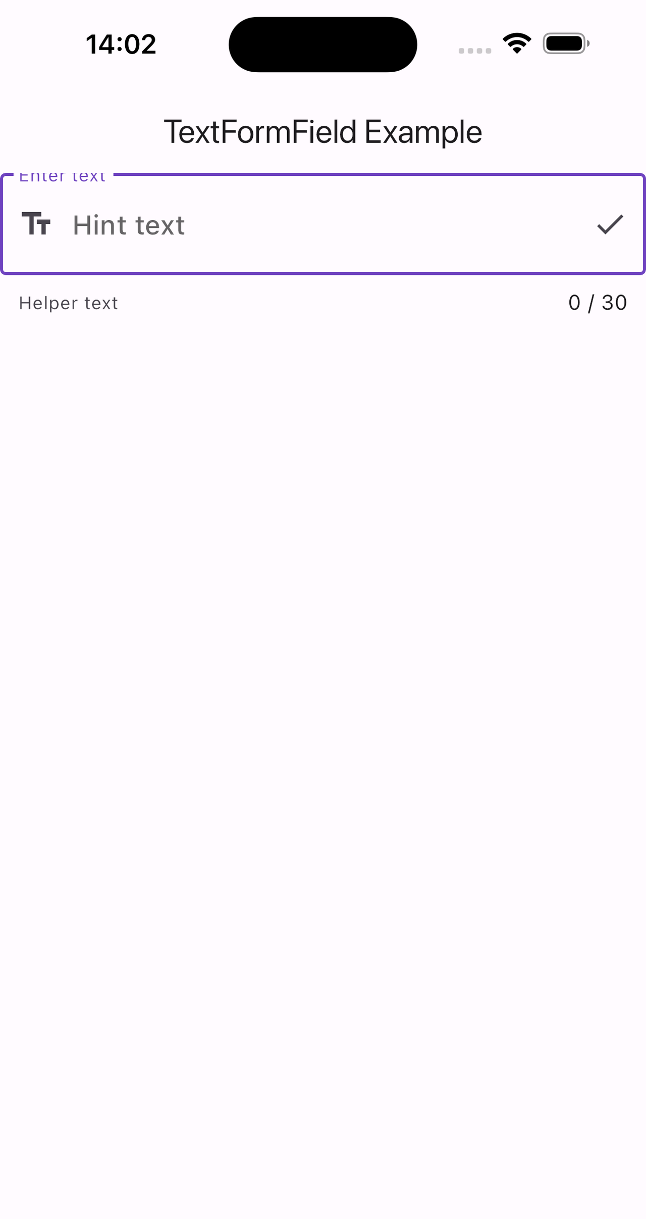
TextFormField
TextFormField 是一个继承自 TextField 的小部件,与 Form 一起使用时可以提供表单验证功能。
属性解释
TextFormField({
    super.key,
    this.controller,
    String? initialValue,
    FocusNode? focusNode,
    InputDecoration? decoration = const InputDecoration(),
    TextInputType? keyboardType,
    TextCapitalization textCapitalization = TextCapitalization.none,
    TextInputAction? textInputAction,
    TextStyle? style,
    StrutStyle? strutStyle,
    TextDirection? textDirection,
    TextAlign textAlign = TextAlign.start,
    TextAlignVertical? textAlignVertical,
    bool autofocus = false,
    bool readOnly = false,
    @Deprecated(
      'Use `contextMenuBuilder` instead. '
      'This feature was deprecated after v3.3.0-0.5.pre.',
    )
    ToolbarOptions? toolbarOptions,
    bool? showCursor,
    String obscuringCharacter = '•',
    bool obscureText = false,
    bool autocorrect = true,
    SmartDashesType? smartDashesType,
    SmartQuotesType? smartQuotesType,
    bool enableSuggestions = true,
    MaxLengthEnforcement? maxLengthEnforcement,
    int? maxLines = 1,
    int? minLines,
    bool expands = false,
    int? maxLength,
    this.onChanged,
    GestureTapCallback? onTap,
    bool onTapAlwaysCalled = false,
    TapRegionCallback? onTapOutside,
    VoidCallback? onEditingComplete,
    ValueChanged<String>? onFieldSubmitted,
    super.onSaved,
    super.validator,
    List<TextInputFormatter>? inputFormatters,
    bool? enabled,
    double cursorWidth = 2.0,
    double? cursorHeight,
    Radius? cursorRadius,
    Color? cursorColor,
    Color? cursorErrorColor,
    Brightness? keyboardAppearance,
    EdgeInsets scrollPadding = const EdgeInsets.all(20.0),
    bool? enableInteractiveSelection,
    TextSelectionControls? selectionControls,
    InputCounterWidgetBuilder? buildCounter,
    ScrollPhysics? scrollPhysics,
    Iterable<String>? autofillHints,
    AutovalidateMode? autovalidateMode,
    ScrollController? scrollController,
    super.restorationId,
    bool enableIMEPersonalizedLearning = true,
    MouseCursor? mouseCursor,
    EditableTextContextMenuBuilder? contextMenuBuilder = _defaultContextMenuBuilder,
    SpellCheckConfiguration? spellCheckConfiguration,
    TextMagnifierConfiguration? magnifierConfiguration,
    UndoHistoryController? undoController,
    AppPrivateCommandCallback? onAppPrivateCommand,
    bool? cursorOpacityAnimates,
    ui.BoxHeightStyle selectionHeightStyle = ui.BoxHeightStyle.tight,
    ui.BoxWidthStyle selectionWidthStyle = ui.BoxWidthStyle.tight,
    DragStartBehavior dragStartBehavior = DragStartBehavior.start,
    ContentInsertionConfiguration? contentInsertionConfiguration,
    MaterialStatesController? statesController,
    Clip clipBehavior = Clip.hardEdge,
    bool scribbleEnabled = true,
    bool canRequestFocus = true,
  })
key: 使用 UniqueKey() 创建唯一标识符。
controller: 控制和监听输入框内容的 TextEditingController 实例。
initialValue: 输入框的初始值。
focusNode: 控制输入框焦点的 FocusNode 实例。
decoration: 配置输入框的装饰,如标签、提示文本等。
keyboardType: 指定键盘类型为 TextInputType.text。
textCapitalization: 设置文本自动大写模式为句首字母大写 (sentences)。
textInputAction: 设置键盘上的操作按钮为 “done”。
style: 设置输入文本的样式。
strutStyle: 设置输入文本的排版样式。
textDirection: 设置文本方向为从左到右。
textAlign: 设置文本水平对齐方式为左对齐。
textAlignVertical: 设置文本垂直对齐方式为顶部对齐。
autofocus: 设置输入框自动获取焦点。
readOnly: 设置输入框非只读。
toolbarOptions: 设置工具栏选项,如复制、剪切、粘贴、全选。
showCursor: 设置显示光标。
obscuringCharacter: 设置隐藏文本时使用的字符(如密码输入)。
obscureText: 设置是否隐藏文本,多用于密码输入。
autocorrect: 设置启用自动拼写检查。
smartDashesType 和 smartQuotesType: 设置智能破折号和引号类型。
enableSuggestions: 设置启用输入建议。
maxLengthEnforcement: 设置最大长度执行策略为强制执行。
maxLines: 设置最大行数为 1。
minLines: 设置最小行数为 1。
expands: 设置输入框不扩展以占用所有可用空间。
maxLength: 设置文本最大长度为 30。
onChanged: 文本改变时的回调函数。
onTap: 点击时的回调函数。
onTapAlwaysCalled: 设置点击后是否总是调用 onTap。
onTapOutside: 点击控件外部时的回调函数。
onEditingComplete: 编辑完成时的回调函数。
onFieldSubmitted: 文本提交时的回调函数。
onSaved: 保存时的回调函数。
validator: 校验器函数,用于验证输入内容。
inputFormatters: 输入格式化程序列表,可用于限制输入类型或模式。
enabled: 设置控件启用。
cursorWidth: 设置光标宽度。
cursorHeight: 设置光标高度。
cursorRadius: 设置光标圆角半径。
cursorColor: 设置光标颜色为红色。
cursorErrorColor: 设置光标错误状态下的颜色。
keyboardAppearance: 设置键盘外观为亮模式。
scrollPadding: 设置滚动填充,默认值为 20.0。
enableInteractiveSelection: 设置启用交互选择。
selectionControls: 自定义选择控件。
buildCounter: 自定义计数器构建方法。
scrollPhysics: 滚动物理特性,设置为 BouncingScrollPhysics(),使滚动具有回弹效果。
autofillHints: 自动填充提示,这里设置为用户名提示 [AutofillHints.username]。
autovalidateMode: 自动验证模式,设置为 AutovalidateMode.onUserInteraction。
scrollController: 滚动控制器,用于控制和监听滚动位置。
restorationId: 设置恢复 ID,这里设置为 ‘textfield_demo’。
enableIMEPersonalizedLearning: 启用输入法个性化学习,设置为 true。
mouseCursor: 鼠标光标样式,设置为文本光标 SystemMouseCursors.text。
contextMenuBuilder: 自定义上下文菜单构建器,使用默认的 AdaptiveTextSelectionToolbar。
spellCheckConfiguration: 拼写检查配置。
magnifierConfiguration: 放大镜配置,这里使用自适应放大镜配置 TextMagnifier.adaptiveMagnifierConfiguration。
undoController: 撤销历史控制器。
onAppPrivateCommand: 接收到私有命令时的回调函数。
cursorOpacityAnimates: 光标不透明度动画,设置为 true。
selectionHeightStyle: 选择高度样式,设置为 ui.BoxHeightStyle.tight。
selectionWidthStyle: 选择宽度样式,设置为 ui.BoxWidthStyle.tight。
dragStartBehavior: 拖动行为,设置为 DragStartBehavior.start。
contentInsertionConfiguration: 内容插入配置,包含一个示例内容插入器。
statesController: 状态控制器。
clipBehavior: 裁剪行为,设置为 Clip.hardEdge。
canRequestFocus: 能否请求焦点,设置为 true。
示例
class TextFormFieldDemo extends StatefulWidget {
  @override
  _TextFormFieldDemoState createState() => _TextFormFieldDemoState();
}

class _TextFormFieldDemoState extends State<TextFormFieldDemo> {
  final TextEditingController _controller = TextEditingController();
  final FocusNode _focusNode = FocusNode();
  final ScrollController _scrollController = ScrollController();
  final MaterialStatesController _statesController = MaterialStatesController();
  final UndoHistoryController _undoController = UndoHistoryController();

  @override
  void dispose() {
    _controller.dispose();
    _focusNode.dispose();
    _scrollController.dispose();
    super.dispose();
  }

  @override
  Widget build(BuildContext context) {
    return Scaffold(
      appBar: AppBar(title: Text('TextFormField Example')),
      body: Form(
        child: SingleChildScrollView(
          child: Column(
            children: [
              TextFormField(
                key: UniqueKey(),
                controller: _controller,
                initialValue: null,
                focusNode: _focusNode,
                decoration: InputDecoration(
                  labelText: 'Enter text',
                  border: OutlineInputBorder(),
                  hintText: 'Hint text',
                  helperText: 'Helper text',
                  prefixIcon: Icon(Icons.text_fields),
                  suffixIcon: Icon(Icons.check),
                ),
                keyboardType: TextInputType.text,
                textCapitalization: TextCapitalization.sentences,
                textInputAction: TextInputAction.done,
                style: TextStyle(color: Colors.blue, fontSize: 18.0),
                strutStyle: StrutStyle(fontSize: 18.0),
                textDirection: TextDirection.ltr,
                textAlign: TextAlign.left,
                textAlignVertical: TextAlignVertical.top,
                autofocus: true,
                readOnly: false,
                toolbarOptions: ToolbarOptions(
                    copy: true, cut: true, paste: true, selectAll: true),
                showCursor: true,
                obscuringCharacter: '*',
                obscureText: false,
                autocorrect: true,
                smartDashesType: SmartDashesType.enabled,
                smartQuotesType: SmartQuotesType.enabled,
                enableSuggestions: true,
                maxLengthEnforcement: MaxLengthEnforcement.enforced,
                maxLines: 1,
                minLines: 1,
                expands: false,
                maxLength: 30,
                onChanged: (text) {
                  print('Text changed to: $text');
                },
                onTap: () {
                  print('TextField tapped');
                },
                onTapAlwaysCalled: false,
                onTapOutside: (event) {
                  print('Tapped outside the TextFormField');
                },
                onEditingComplete: () {
                  print('Editing complete');
                },
                onFieldSubmitted: (text) {
                  print('Text submitted: $text');
                },
                onSaved: (text) {
                  print('Text saved: $text');
                },
                validator: (text) {
                  if (text == null || text.isEmpty) {
                    return 'This field cannot be empty';
                  }
                  return null;
                },
                inputFormatters: [
                  FilteringTextInputFormatter.allow(RegExp(r'[a-zA-Z]'))
                ],
                enabled: true,
                cursorWidth: 2.0,
                cursorHeight: 24.0,
                cursorRadius: Radius.circular(2.0),
                cursorColor: Colors.red,
                cursorErrorColor: Colors.redAccent,
                keyboardAppearance: Brightness.light,
                scrollPadding: EdgeInsets.all(20.0),
                enableInteractiveSelection: true,
                selectionControls: materialTextSelectionControls,
                buildCounter: (
                  BuildContext context, {
                  required int currentLength,
                  required bool isFocused,
                  required int? maxLength,
                }) {
                  return Text('$currentLength / $maxLength');
                },
                scrollPhysics: BouncingScrollPhysics(),
                autofillHints: [AutofillHints.username],
                autovalidateMode: AutovalidateMode.onUserInteraction,
                scrollController: _scrollController,
                restorationId: 'textfield_demo',
                scribbleEnabled: true,
                enableIMEPersonalizedLearning: true,
                mouseCursor: SystemMouseCursors.text,
                contextMenuBuilder: (BuildContext context,
                    EditableTextState editableTextState) {
                  return AdaptiveTextSelectionToolbar.editableText(
                    editableTextState: editableTextState,
                  );
                },
                spellCheckConfiguration: SpellCheckConfiguration(),
                magnifierConfiguration:
                    TextMagnifier.adaptiveMagnifierConfiguration,
                undoController: _undoController,
                onAppPrivateCommand:
                    (String action, Map<String, dynamic> data) {
                  print('Received private command: $action');
                },
                cursorOpacityAnimates: true,
                selectionHeightStyle: ui.BoxHeightStyle.tight,
                selectionWidthStyle: ui.BoxWidthStyle.tight,
                dragStartBehavior: DragStartBehavior.start,
                contentInsertionConfiguration: ContentInsertionConfiguration(
                  onContentInserted: (KeyboardInsertedContent value) {
                    print('Content inserted: $value');
                  },
                ),
                statesController: _statesController,
                clipBehavior: Clip.hardEdge,
                canRequestFocus: true,
              ),
            ],
          ),
        ),
      ),
    );
  }
}
从上面的示例结果中我们可以看出,TextField和TextFormField结果基本一致,但它们在功能和使用场景上有一些关键的区别。
CupertinoTextField
CupertinoTextField 提供类似 iOS 风格的文本输入框,适合在使用 Cupertino 风格的小部件中使用。
需要导入:import ‘package:flutter/cupertino.dart’;
属性解析
const CupertinoTextField({
    super.key,
    this.controller,
    this.focusNode,
    this.undoController,
    this.decoration = _kDefaultRoundedBorderDecoration,
    this.padding = const EdgeInsets.all(7.0),
    this.placeholder,
    this.placeholderStyle = const TextStyle(
      fontWeight: FontWeight.w400,
      color: CupertinoColors.placeholderText,
    ),
    this.prefix,
    this.prefixMode = OverlayVisibilityMode.always,
    this.suffix,
    this.suffixMode = OverlayVisibilityMode.always,
    this.clearButtonMode = OverlayVisibilityMode.never,
    this.clearButtonSemanticLabel,
    TextInputType? keyboardType,
    this.textInputAction,
    this.textCapitalization = TextCapitalization.none,
    this.style,
    this.strutStyle,
    this.textAlign = TextAlign.start,
    this.textAlignVertical,
    this.textDirection,
    this.readOnly = false,
    @Deprecated(
      'Use `contextMenuBuilder` instead. '
      'This feature was deprecated after v3.3.0-0.5.pre.',
    )
    this.toolbarOptions,
    this.showCursor,
    this.autofocus = false,
    this.obscuringCharacter = '•',
    this.obscureText = false,
    this.autocorrect = true,
    SmartDashesType? smartDashesType,
    SmartQuotesType? smartQuotesType,
    this.enableSuggestions = true,
    this.maxLines = 1,
    this.minLines,
    this.expands = false,
    this.maxLength,
    this.maxLengthEnforcement,
    this.onChanged,
    this.onEditingComplete,
    this.onSubmitted,
    this.onTapOutside,
    this.inputFormatters,
    this.enabled = true,
    this.cursorWidth = 2.0,
    this.cursorHeight,
    this.cursorRadius = const Radius.circular(2.0),
    this.cursorOpacityAnimates = true,
    this.cursorColor,
    this.selectionHeightStyle = ui.BoxHeightStyle.tight,
    this.selectionWidthStyle = ui.BoxWidthStyle.tight,
    this.keyboardAppearance,
    this.scrollPadding = const EdgeInsets.all(20.0),
    this.dragStartBehavior = DragStartBehavior.start,
    bool? enableInteractiveSelection,
    this.selectionControls,
    this.onTap,
    this.scrollController,
    this.scrollPhysics,
    this.autofillHints = const <String>[],
    this.contentInsertionConfiguration,
    this.clipBehavior = Clip.hardEdge,
    this.restorationId,
    this.scribbleEnabled = true,
    this.enableIMEPersonalizedLearning = true,
    this.contextMenuBuilder = _defaultContextMenuBuilder,
    this.spellCheckConfiguration,
    this.magnifierConfiguration,
  })
controller: TextEditingController 用于控制文本内容和监听变化。
focusNode: 管理焦点状态。
decoration: 输入框的装饰,比如边框、背景等。
padding: 内边距。
placeholder: 占位符文本。
placeholderStyle: 占位符文本的样式。
prefix/suffix: 前缀/后缀小部件。
clearButtonMode: 控制清除按钮的显示模式。
keyboardType: 键盘类型,如文本、数字等。
textInputAction: 键盘上的操作按钮行为。
textCapitalization: 文本自动大写设置。
style: 输入文本的样式。
readOnly: 是否只读。
showCursor: 是否显示光标。
autofocus: 是否自动获取焦点。
obscuringCharacter/obscureText: 隐藏输入字符(通常用于密码)。
autocorrect: 是否启用自动更正。
maxLines/minLines: 最大/最小行数。
expands: 是否扩展以填充父容器。
maxLength: 最大输入长度。
onChanged: 输入内容变化时的回调。
onEditingComplete: 编辑完成时的回调。
onSubmitted: 提交(如按下回车)时的回调。
inputFormatters: 输入格式化器。
enabled: 是否启用输入框。
cursorWidth/cursorHeight: 光标宽度和高度。
cursorColor: 光标颜色。
scrollPadding: 滚动填充。
onTap: 点击输入框时的回调。
scrollController: 滚动控制器。
scrollPhysics: 滚动物理特性。
autofillHints: 自动填充提示。
contentInsertionConfiguration: 内容插入配置。
restorationId: 恢复 ID,用于状态恢复。
示例
class CupertinoTextFieldDemo extends StatefulWidget {
  @override
  _CupertinoTextFieldDemoState createState() => _CupertinoTextFieldDemoState();
}

class _CupertinoTextFieldDemoState extends State<CupertinoTextFieldDemo> {
  final TextEditingController _controller = TextEditingController();
  final FocusNode _focusNode = FocusNode();

  @override
  void dispose() {
    _controller.dispose();
    _focusNode.dispose();
    super.dispose();
  }

  @override
  Widget build(BuildContext context) {
    return Scaffold(
      appBar: AppBar(title: Text('CupertinoTextField Example')),
      body: CupertinoTextField(
        controller: _controller,
        focusNode: _focusNode,
        decoration: BoxDecoration(
          border: Border.all(color: CupertinoColors.lightBackgroundGray),
          borderRadius: BorderRadius.circular(8.0),
        ),
        padding: EdgeInsets.all(12.0),
        placeholder: 'Enter text',
        placeholderStyle: TextStyle(
          color: CupertinoColors.placeholderText,
          fontStyle: FontStyle.italic,
        ),
        prefix: Padding(
          padding: EdgeInsets.all(4.0),
          child: Icon(CupertinoIcons.person, color: CupertinoColors.systemGrey),
        ),
        suffix: GestureDetector(
          onTap: () {
            _controller.clear();
          },
          child: Padding(
            padding: EdgeInsets.all(4.0),
            child: Icon(CupertinoIcons.clear_thick_circled,
                color: CupertinoColors.systemGrey),
          ),
        ),
        clearButtonMode: OverlayVisibilityMode.editing,
        keyboardType: TextInputType.text,
        textInputAction: TextInputAction.done,
        textCapitalization: TextCapitalization.sentences,
        style: TextStyle(color: CupertinoColors.black, fontSize: 18.0),
        readOnly: false,
        showCursor: true,
        autofocus: true,
        obscureText: false,
        autocorrect: true,
        maxLines: 1,
        expands: false,
        maxLength: 50,
        onChanged: (text) {
          print('Text changed to: $text');
        },
        onSubmitted: (text) {
          print('Text submitted: $text');
        },
        inputFormatters: [
          FilteringTextInputFormatter.allow(RegExp(r'[a-zA-Zs]'))
        ],
        enabled: true,
        cursorWidth: 2.0,
        cursorColor: CupertinoColors.activeBlue,
        scrollPadding: EdgeInsets.all(20.0),
        onTap: () {
          print('CupertinoTextField tapped');
        },
        autofillHints: [AutofillHints.username],
        restorationId: 'cupertino_text_field_demo',
      ),
    );
  }
}
![图片[2] - Flutter 初识:输入文本控件 - 宋马](https://pic.songma.com/blogimg/20250505/9cbe8ba5eb794954a14bfb9f73d9b576.png)
AutofillGroup
AutofillGroup 允许多个文本输入字段共享相同的自动填充上下文。它可以将一组表单字段分组,以便系统可以更好地识别和填充这些字段。
属性解析
const AutofillGroup({
    super.key,
    required this.child,
    this.onDisposeAction = AutofillContextAction.commit,
  });
child: 必需的属性,要嵌套的子组件,通常是包含多个输入字段的表单。
onDisposeAction: 指定在 AutofillGroup 被处理时(例如被 dispose 时)要执行的操作。默认值为 AutofillContextAction.commit,你也可以选择 AutofillContextAction.cancel。
示例
class AutofillGroupDemo extends StatefulWidget {
  @override
  _AutofillGroupDemoState createState() => _AutofillGroupDemoState();
}

class _AutofillGroupDemoState extends State<AutofillGroupDemo> {
  final TextEditingController _usernameController = TextEditingController();
  final TextEditingController _passwordController = TextEditingController();

  @override
  void dispose() {
    _usernameController.dispose();
    _passwordController.dispose();
    super.dispose();
  }

  @override
  Widget build(BuildContext context) {
    return Scaffold(
      appBar: AppBar(title: Text('AutofillGroup Example')),
      body: Form(
        child: AutofillGroup(
          onDisposeAction: AutofillContextAction.commit,
          child: Column(
            children: [
              TextFormField(
                controller: _usernameController,
                autofillHints: [AutofillHints.username],
                decoration: InputDecoration(labelText: 'Username'),
              ),
              SizedBox(height: 16.0),
              TextFormField(
                controller: _passwordController,
                autofillHints: [AutofillHints.password],
                obscureText: true,
                decoration: InputDecoration(labelText: 'Password'),
              ),
              SizedBox(height: 32.0),
              ElevatedButton(
                onPressed: () {
                  if (Form.of(context).validate()) {
                    // Process the data.
                    print('Form is valid');
                  } else {
                    print('Form is not valid');
                  }
                },
                child: Text('Submit'),
              ),
            ],
          ),
        ),
      ),
    );
  }
}
解释
AutofillGroup: 将多个输入字段放在一个 AutofillGroup 中,以便它们可以共享相同的自动填充上下文。
child: 包含两个 TextFormField,分别对应用户名和密码输入框。
onDisposeAction: 设置为 AutofillContextAction.commit,这意味着当 AutofillGroup 被废弃时,将提交自动填充上下文中的数据。
扩展阅读
AutofillContextAction
AutofillContextAction 有两个选项:
commit: 提交当前的自动填充上下文。这是默认行为,用于保存用户已填写的数据。
cancel: 取消当前的自动填充上下文。一般情况下很少使用。
使用场景
AutofillGroup 通常在需要确保多个相关输入字段能够协同工作进行自动填充时使用,例如注册或登录表单等场景。
EditableText
EditableText 是一个低级别的文本输入组件,它提供了更高的可定制性,但需要手动处理许多细节。TextField 和 TextFormField 都是基于 EditableText 实现的。
属性解析
EditableText({
    super.key,
    required this.controller,
    required this.focusNode,
    this.readOnly = false,
    this.obscuringCharacter = '•',
    this.obscureText = false,
    this.autocorrect = true,
    SmartDashesType? smartDashesType,
    SmartQuotesType? smartQuotesType,
    this.enableSuggestions = true,
    required this.style,
    StrutStyle? strutStyle,
    required this.cursorColor,
    required this.backgroundCursorColor,
    this.textAlign = TextAlign.start,
    this.textDirection,
    this.locale,
    @Deprecated(
      'Use textScaler instead. '
      'Use of textScaleFactor was deprecated in preparation for the upcoming nonlinear text scaling support. '
      'This feature was deprecated after v3.12.0-2.0.pre.',
    )
    this.textScaleFactor,
    this.textScaler,
    this.maxLines = 1,
    this.minLines,
    this.expands = false,
    this.forceLine = true,
    this.textHeightBehavior,
    this.textWidthBasis = TextWidthBasis.parent,
    this.autofocus = false,
    bool? showCursor,
    this.showSelectionHandles = false,
    this.selectionColor,
    this.selectionControls,
    TextInputType? keyboardType,
    this.textInputAction,
    this.textCapitalization = TextCapitalization.none,
    this.onChanged,
    this.onEditingComplete,
    this.onSubmitted,
    this.onAppPrivateCommand,
    this.onSelectionChanged,
    this.onSelectionHandleTapped,
    this.onTapOutside,
    List<TextInputFormatter>? inputFormatters,
    this.mouseCursor,
    this.rendererIgnoresPointer = false,
    this.cursorWidth = 2.0,
    this.cursorHeight,
    this.cursorRadius,
    this.cursorOpacityAnimates = false,
    this.cursorOffset,
    this.paintCursorAboveText = false,
    this.selectionHeightStyle = ui.BoxHeightStyle.tight,
    this.selectionWidthStyle = ui.BoxWidthStyle.tight,
    this.scrollPadding = const EdgeInsets.all(20.0),
    this.keyboardAppearance = Brightness.light,
    this.dragStartBehavior = DragStartBehavior.start,
    bool? enableInteractiveSelection,
    this.scrollController,
    this.scrollPhysics,
    this.autocorrectionTextRectColor,
    @Deprecated(
      'Use `contextMenuBuilder` instead. '
      'This feature was deprecated after v3.3.0-0.5.pre.',
    )
    ToolbarOptions? toolbarOptions,
    this.autofillHints = const <String>[],
    this.autofillClient,
    this.clipBehavior = Clip.hardEdge,
    this.restorationId,
    this.scrollBehavior,
    this.scribbleEnabled = true,
    this.enableIMEPersonalizedLearning = true,
    this.contentInsertionConfiguration,
    this.contextMenuBuilder,
    this.spellCheckConfiguration,
    this.magnifierConfiguration = TextMagnifierConfiguration.disabled,
    this.undoController,
  })
controller: TextEditingController,用于管理和监听输入文本的变化。
focusNode: FocusNode,用于管理焦点状态。
readOnly: 是否只读,默认值为 false。
obscuringCharacter: 隐藏字符时使用的替代字符,默认是 •。
obscureText: 是否隐藏文本(如密码输入),默认值为 false。
autocorrect: 是否启用自动更正,默认值为 true。
enableSuggestions: 是否启用文本建议,默认值为 true。
style: 文本样式,如字体大小、颜色等。
cursorColor: 光标颜色。
backgroundCursorColor: 背景光标颜色。
textAlign: 文本对齐方式,默认值为 TextAlign.start。
textDirection: 文本方向,可以设置为从左到右或从右到左。
locale: 文本区域设置。
textScaler: 控制文本缩放比例(取代了 textScaleFactor)。
maxLines: 最大行数,默认为 1 行。
minLines: 最小行数。
expands: 是否扩展以填满父容器,默认为 false。
forceLine: 是否强制换行,默认值为 true。
textHeightBehavior: 文本高度行为。
textWidthBasis: 文本宽度基准,默认值为 TextWidthBasis.parent。
autofocus: 是否自动获取焦点,默认值为 false。
showSelectionHandles: 是否显示选择句柄。
selectionColor: 选择文本时的颜色。
selectionControls: 自定义选择控制器。
keyboardType: 键盘类型。
textInputAction: 键盘上的操作按钮行为。
textCapitalization: 文本大写设置。
onChanged: 输入内容变化时的回调。
onEditingComplete: 编辑完成时的回调。
onSubmitted: 提交(如按下回车)时的回调。
onAppPrivateCommand: 处理来自输入法的私有命令。
onSelectionChanged: 选择变化时的回调。
onSelectionHandleTapped: 选择句柄被点击时的回调。
onTapOutside: 当点击输入框外部时的回调。
inputFormatters: 输入格式化器。
mouseCursor: 鼠标光标样式。
rendererIgnoresPointer: 渲染器是否忽略指针事件。
cursorWidth/cursorHeight: 光标宽度和高度。
cursorRadius: 光标半径。
cursorOpacityAnimates: 光标是否动画显示。
cursorOffset: 光标偏移量。
paintCursorAboveText: 光标是否绘制在文本上方。
selectionHeightStyle: 选择高度样式。
selectionWidthStyle: 选择宽度样式。
scrollPadding: 滚动填充。
keyboardAppearance: 键盘外观(亮色或暗色)。
dragStartBehavior: 拖拽行为,默认值为 DragStartBehavior.start。
enableInteractiveSelection: 是否启用交互式选择。
scrollController: 控制滚动行为。
scrollPhysics: 滚动物理特性。
autocorrectionTextRectColor: 自动更正矩形颜色。
toolbarOptions: 工具栏选项(已废弃,使用 contextMenuBuilder)。
autofillHints: 自动填充提示。
clipBehavior: 剪裁行为,默认值为 Clip.hardEdge。
restorationId: 恢复ID,用于状态恢复。
scrollBehavior: 滚动行为。
scribbleEnabled: 是否启用 Scribble 功能。
enableIMEPersonalizedLearning: 是否启用IME个性化学习。
contentInsertionConfiguration: 内容插入配置。
contextMenuBuilder: 用于构建上下文菜单的小部件。
spellCheckConfiguration: 拼写检查配置。
magnifierConfiguration: 放大镜配置,默认值为 TextMagnifierConfiguration.disabled。
undoController: 撤销控制器。
示例
class EditableTextDemo extends StatefulWidget {
  @override
  _EditableTextDemoState createState() => _EditableTextDemoState();
}

class _EditableTextDemoState extends State<EditableTextDemo> {
  final TextEditingController _controller = TextEditingController();
  final FocusNode _focusNode = FocusNode();

  @override
  void dispose() {
    _controller.dispose();
    _focusNode.dispose();
    super.dispose();
  }

  @override
  Widget build(BuildContext context) {
    return Scaffold(
      appBar: AppBar(title: Text('EditableText Example')),
      body: Center(
        child: EditableText(
          controller: _controller,
          focusNode: _focusNode,
          style: TextStyle(color: Colors.black, fontSize: 18.0),
          cursorColor: Colors.blue,
          backgroundCursorColor: Colors.grey,
          textAlign: TextAlign.start,
          autofocus: true,
          obscureText: false,
          obscuringCharacter: '•',
          autocorrect: true,
          smartDashesType: SmartDashesType.enabled,
          smartQuotesType: SmartQuotesType.enabled,
          enableSuggestions: true,
          strutStyle: StrutStyle.disabled,
          textDirection: TextDirection.ltr,
          locale: Locale.fromSubtags(languageCode: 'en'),
          textScaler: TextScaler.noScaling,
          maxLines: 1,
          minLines: 1,
          expands: false,
          forceLine: true,
          textHeightBehavior: TextHeightBehavior(
            applyHeightToFirstAscent: false,
            applyHeightToLastDescent: true,
          ),
          textWidthBasis: TextWidthBasis.parent,
          showSelectionHandles: true,
          selectionColor: Colors.lightBlueAccent,
          selectionControls: materialTextSelectionControls,
          keyboardType: TextInputType.text,
          textInputAction: TextInputAction.done,
          textCapitalization: TextCapitalization.none,
          onChanged: (text) {
            print('Text changed to: $text');
          },
          onEditingComplete: () {
            print('Editing complete');
          },
          onSubmitted: (text) {
            print('Text submitted: $text');
          },
          onAppPrivateCommand: (action, data) {
            print('Received private command: $action, data: $data');
          },
          onSelectionChanged: (selection, cause) {
            print('Selection changed to: $selection, cause: $cause');
          },
          onSelectionHandleTapped: () {
            print('Selection handle tapped');
          },
          onTapOutside: (_) {
            print('Tapped outside of the text field');
          },
          inputFormatters: [
            FilteringTextInputFormatter.allow(RegExp('[a-zA-Z]'))
          ],
          mouseCursor: SystemMouseCursors.text,
          rendererIgnoresPointer: false,
          cursorWidth: 2.0,
          cursorHeight: 20.0,
          cursorRadius: Radius.circular(2.0),
          cursorOpacityAnimates: true,
          cursorOffset: Offset(0, 0),
          paintCursorAboveText: false,
          selectionHeightStyle: BoxHeightStyle.tight,
          selectionWidthStyle: BoxWidthStyle.tight,
          scrollPadding: EdgeInsets.all(20.0),
          keyboardAppearance: Brightness.light,
          dragStartBehavior: DragStartBehavior.start,
          enableInteractiveSelection: true,
          scrollController: ScrollController(),
          scrollPhysics: BouncingScrollPhysics(),
          autocorrectionTextRectColor: Colors.pink,
          autofillHints: [AutofillHints.username],
          restorationId: 'editable_text_demo',
          clipBehavior: Clip.hardEdge,
          scrollBehavior:
              ScrollConfiguration.of(context).copyWith(scrollbars: false),
          scribbleEnabled: true,
          enableIMEPersonalizedLearning: true,
          contentInsertionConfiguration: ContentInsertionConfiguration(
            onContentInserted: (content) {
              print('Content inserted: $content');
            },
          ),
          contextMenuBuilder: (context, editableTextState) {
            return AdaptiveTextSelectionToolbar.editableText(
              editableTextState: editableTextState,
            );
          },
          spellCheckConfiguration: SpellCheckConfiguration(
            misspelledTextStyle: TextStyle(
                decoration: TextDecoration.underline, color: Colors.red),
          ),
          magnifierConfiguration: TextMagnifierConfiguration.disabled,
          undoController: UndoHistoryController(),
        ),
      ),
    );
  }
}
![图片[3] - Flutter 初识:输入文本控件 - 宋马](https://pic.songma.com/blogimg/20250505/7efd739d8ddc440bacecf7bb3a301cf7.png)
备注:在某些情况下需要添加misspelledTextStyle: TextStyle(decoration: TextDecoration.underline, color: Colors.red),
TextField和TextFormField区别
TextField
TextField 是一个独立的文本输入控件,可以用来接收用户输入。它不依赖于表单验证机制,一般用于简单的用户输入场景。
主要特点
不依赖于 Form 小部件。
没有内置的验证功能。
使用更灵活,可以在任何地方使用,不需要在表单中。
TextFormField
TextFormField 是基于 TextField 扩展出来的,它集成了表单验证功能并且可以与 Form 小部件一起使用,用于更复杂的表单输入和验证场景。
主要特点
需要在 Form 中使用。
支持表单验证,可以通过设置 validator 属性自定义验证逻辑。
与 Form 一起工作时,可以方便地进行统一的表单提交和验证操作。
总结
TextField: 独立的文本输入框,适合简单的输入场景,没有内置的验证功能。
TextFormField: 基于 TextField 的扩展,集成了表单验证功能,适合复杂的表单场景,需要在 Form 中使用。
CupertinoTextField: iOS 风格的文本输入框。
AutofillGroup: 允许多个文本输入字段共享自动填充上下文。
EditableText: 更底层的文本输入组件,提供高度可定制性。
备注:
1、flutter_quill(第三方库)
flutter_quill 是一个功能强大的富文本编辑器,类似于 Quill.js。它适合需要复杂文本编辑功能的应用,如博客编辑器、文章发布平台等
flutter_quill:https://pub.dev/packages/flutter_quill
2、html_editor_enhanced(第三方库)
html_editor_enhanced 是一个 Flutter 插件,用于在应用中集成 HTML 富文本编辑器。该插件基于 Quill.js 实现,提供了丰富的编辑功能。
html_editor_enhanced:https://pub.dev/packages/html_editor_enhanced


暂无评论内容